Medicus is a "Health & Beauty" oriented HTML5 Template, built to serve as a foundation for your web projects. The Design is based on fine typography and large photography. It is build with Twitter Bootstrap, the front-end development framework with a steep learning curve that changes the way you develop sites. Medicus lets you build your pages with a great collection of section layouts and helper classes that offer extreme flexibility and pixel-perfect design.
To use the template you have to be familiar with HTML & CSS. The demo is self-explanatory and you can easily study the HTML files to discover how to customise the templates to your needs. This documentation covers some basics to help you get started... If you are a web developer you are about to boost your development workflow!
Designed by Plethora Themes
Responsive Grid, Layout & Styling
The Grid (it is Bootstrap as you know it!)
Medicus uses Twitter Bootstrap to build the responsive grid. You should study it if you aren't familiar already. Bootstrap includes a responsive, mobile first fluid grid system that appropriately scales up to 12 columns as the device or viewport size increases. It includes predefined classes for easy layout options, as well as powerful mixins for generating more semantic layouts.

Medicus uses bootstrap to style all HTML elements so it is a good idea to study all of bootstrap capabilities.
LESS & CSS
Medicus makes heavy use of LESS to style its content but you may as well work with CSS. The LESS files responsible for the styling are in the
the assets/less folder while their CSS compiled counterparts reside at assets/css.
 less
|- theme_variables.less
|- theme_custom_bootstrap.less
|- style.less
|- ... other files
 css
|- theme_custom_bootstrap.css
|- style.css
|- ... other files
First, we load assets/css/theme_custom_bootstrap.css which is a light version of Bootstrap Framework, made especially for Medicus.
Its LESS counterpart assets/less/theme_custom_bootstrap.less is an exact copy of assets/twitter-bootstrap/less/bootstrap.less
with certain sections commented out. To exclude styles that you don't need, or to enable some that we left out, edit assets/less/theme_custom_bootstrap.less
and recompile to its CSS counterpart in the assets/css folder.
Finaly, we load assets/css/style.css which is the main stylesheet for the theme. Its LESS couterpart assets/less/style.less is the powerfull
constructor of this template which imports the very important assets/less/theme_variables.less file where all the colors, typography and other various settings reside.
So, for example, if you need to change the colors of your template, you can just edit assets/less/theme_variables.less file, replace just one variable and recompile
style.less

We compile LESS locally and not on the server. That means we use tools like Prepros or CodeKit. Check out this article. If you need to learn more about LESS, visit LESSCSS.org
Apart from the css files we talk about in this section, we also use some other css files that belong to external libraries and reside in the css folder.
JADE & HTML Templating engine
In order to produce the final HTML Template files, we use JADE and although you don't have to use it yourself, we incude it in our package for all of those who are familiar
or wish to start playing around! The JADE files reside in the assets/jade folder while their HTML compiled counterparts reside at the root folder of the package.
 medicus-html
|-  assets
   |-  jade
      |-  templates
      |- 404.jade
      |- about-us.jade
      |- blog.jade
      |- ... other JADE files
 medicus-html
|- 404.html
|- about-us.html
|- blog.html
|- ... other HTML files
We included a special config.jade file from where you can globaly enable or disable css and script loading. You can also choose between development or production mode.
In production mode, scripts are loaded minified. To enable specific scripts per page, you can override the configuration variables to true in the specific JADE template file.
We compile JADE locally and not on the server. That means we use tools like Prepros or CodeKit. If you need to learn more about JADE, visit jade-lang.com
Javascript & the way we use it
Javascript is used extensively in Medicus in order for some of its features to work. These features include the Sliders, the menu, the newsletter and the forms, parallax effects,
the lightbox, google maps etc. All the files needed, reside in the assets/js folder in both normal and minified versions. The corresponding scripts are called from the various HTML pages
depenting on the features that are used in each page.
A specific pair of files has a special importance for Medicus. In theme.js you can find some custom scripts that we use for layout purposes and in config.js you can
configure the most common settings for all js scripts, without you needing to dig up in the code to change them.
The General Layout Concept
The pages have 4 basic areas: The Header, The Head Panel, The Main Area and the Footer.
We found this setup to be simple and semantic. The header and the footer are meant to be common on every page while the main area is where you put sections with different layouts. The head panel is optional and is meant to host sliders, maps, big background photos and page titles & subtitles. We are examining these 4 basic areas in detail below.
Visual interpretation of the code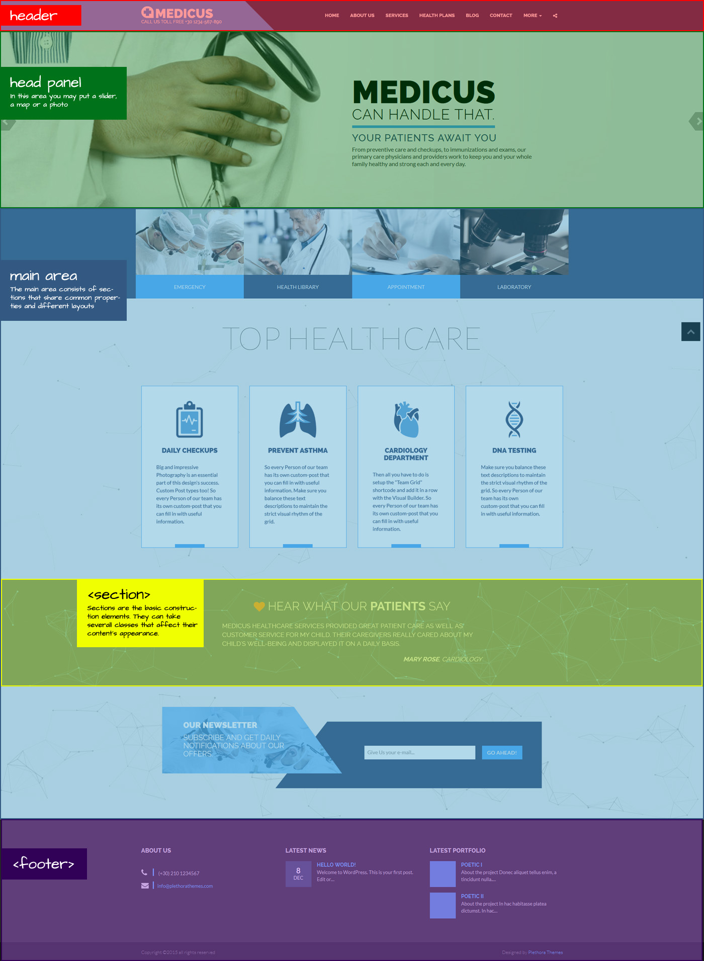
The General Styling Concept
The styling of any element of the page is based on the concept of Helper Classes. These cover a wide range of styling issues such as the colors of an element and its sub-elements, the dimensions, the paddings, the alignments (on both axis) etc. Let's examine them bellow...
Color Scheme helper styling classes (6)
These classes set the background, the text, the link and the link:hover colors of any element they are applied on, and its children also. They take their name from the background-color they use.
skincolored_section@brand-primary colorsecondary_section@brand-secondarydark_sectionlight_sectionblack_sectionwhite_section
assets/less/theme_variables.less if you work with LESS.
If you set a background image in a section that is mainly dark-colored, then by setting the section to .dark_section you acknowledge that you want the text of this section to take the color that you have set for a dark_section and is obviously in contrast with a dark background. That is the concept...
You can visualize all these by visiting our Design Elements Playground and clicking on the icon on your right,
or by appending the ?enableStyleSwitcher query string in any of our demo pages' URL. For example:
http://plethorathemes.com/html/medicus/about-us.html?enableStyleSwitcher
Have Fun!
Gradient Angled Backgrounds (14)
These classes set the background of a section as a Flat Primary to Secondary color gradient (or vice-versa) with an angle. It is the effect you see on the header and the footer. Some of them are inter-depentent.
gradientPrimary to Secondary color, no angle, split 50-50gradient diagonal-30With an angle of 45, split 30-70gradient diagonal-50With an angle of 45, split 50-50gradient diagonal-70With an angle of 45, split 70-30gradient diagonal-30-minusangleWith an angle of -45, split 30-70gradient diagonal-50-minusangleWith an angle of -45, split 50-50gradient diagonal-70-minusangleWith an angle of -45, split 70-30gradient-invertSecondary to Primary color, no angle, split 50-50gradient-invert diagonal-30-invertWith an angle of 45, split 30-70gradient-invert diagonal-50-invertWith an angle of 45, split 50-50gradient-invert diagonal-70-invertWith an angle of 45, split 70-30gradient-invert diagonal-30-minusangle-invertWith an angle of -45, split 30-70gradient-invert diagonal-50-minusangle-invertWith an angle of -45, split 50-50gradient-invert diagonal-70-minusangle-invertWith an angle of -45, split 70-30
assets/less/theme_variables.less if you work with LESS.
Transparent overlays
These classes overlay a transparent film in front of the background of any element. Its basic color is set by the color-scheme class of the element.
transparent-filmgradient-film-to-topaka dégradé...gradient-film-to-bottom
For example, if you set a section with a background-photo as .skincolored.transparent-film, the transparent film will be the skincolor faded by the percentage of the transparency you have set on theme_variables.less.
Full Height, Full Width and Vertical Alignment of a Section
You can set a section to have a minimum height same to the screen height and vertically align the content. (Interdepentant classes)
full_heightVertical topfull_height vertical_centerfull_height vertical_bottomfull_widthAllow the section content to capture the entire screen width.
Paddings and Margins (relative to @section-vertical-padding: 55px;)
no_paddingNo Top or Bottom Paddingno_padding_topno_padding_bottompadding_toppadding_bottompadding_top_halfpadding_bottom_halfno_marginNo Top or Bottom Marginno_margin_topno_margin_bottommargin_topmargin_bottommargin_top_halfmargin_bottom_halfmargin_top_gridEqual to the double col paddingmargin_bottom_gridno_cols_paddingNo horizontal Padding for the columns of a section
Vertical Align and heights of a Section's Columns
vcenterAlignes columns of a section that have different heights to their vertical centersvbottomsame_height_colWhen applied to 2 or more different-height-columns of a section, it makes them of equal height
You can visualize all these by visiting our Design Elements Playground and clicking on the icon on your right,
or by appending the ?enableStyleSwitcher query string in any of our demo pages' URL. For example:
http://plethorathemes.com/html/medicus/about-us.html?enableStyleSwitcher
Have Fun!
Responsive Stretchy Wrappers that keep a dimesions ratio
Inter-Dependent ...
stretchy-wrapperRatio 16:9stretchy-wrapper ratio_15-9stretchy-wrapper ratio_12-5stretchy-wrapper ratio_4-3stretchy-wrapper ratio_2-1stretchy-wrapper ratio_1-1stretchy-wrapper ratio_5-1
Other Misc. Helper Classes
Can be set on any element.
transparentcenteredelevateboxedboxed_plusboxed-specialneutralize_linksIf used on a color-schemed item, the links get the color of the textlinkifyApplied on a link, it will open the .main section of the URL in an AJAX ModalscrollifyApplied on a link with a hashtag, it will scroll to the target id smoothlyclick-disableApplied on an img it will make it unselectable (Thanks to Andrew Chs)
Header Section
The header section is where the logo, the menu and the optional top-bar reside . Its height is not set explicitly but it depents on the vertical
margin of the logo. It can be set to move along with the page when you scroll (relative position), or it can be always on top (sticky).
In order to make it sticky, you just have to add the class sticky_header to the body element.
The background color of the header's mainbar (logo and menu) can be solid or gradient (brand-primary to brand-secondary).
The gradient may be horizontal or diagonal. All these are set by adding or excluding the appropriate classes to the .mainbar element.
You may also make the whole header transparent (opaque) by adding the class .transparent to the .header.
The angle of the diagonal gradient can be set from the assets/less/theme_variables.less if you use LESS. Also from there you can set the colors of the two areas and the percentage of the containers length, that the angle will be placed.
Header Background Setup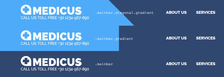
The Logo Area
In the Logo Area you may put a title text or an image and you can optionally use a sub-title text.
The logo image maximum height can be set from assets/less/theme_variables.less if you use LESS. If you use CSS, go to your assets/css/style.css file and locate the following code and change the max-height to the pixels you wish. The width will adapt proportionally.
Title Text Logo
Just Image Logo
Image Logo and Sub-Title
The Menu
You can study its structure by simply looking at the code of any template HTML file of Medicus that has a menu.
The dropdown menus open on click by default or on hover if you add class .hover_menu to the ul.main_menu.
If you want your dropdown menu to split into 2 columns, just add class="two-column dropleft" to the appropriate li tag. "dropleft" can also be "dropright"
if you wish.
The menu is transformed on mobile devices. To set the width below which the menu will be transformed (aka "The BreakPoint"), you have to go to assets/css/style.css and change the corresponding media query number to fit your needs.
Head Media Panel Section
In the Head Panel Section you may put a Slider, a Background Photo or Color with optional title & subtitle, a Google Map or you may just decide not to include it at all. It has a variable height that you can set with LESS or CSS.
Heading Group (.hgroup)
The Heading Group Items (Title and Subtitle) can be styled with helper color-scheme classes such as ".dark_section" or ".transparent-film" as well as with the special
class diagonal-bgcolor-trans that is responsible for the angled effect.
Simple Head Panel example
Head Panel with Background Photo
Slider and its Captions
The Slider that you can find on the Head Panel area of the Home page, is powered by OWL Carousel 2. You can setup various settings
that control its looks by going to assets/js/config.js
The slider on the home page has it own responsive, specific ratio dimensions that are set by the special .ratio_slider class.
This can be changed to our other ratios like .ratio_16-9, .ratio_2-1 etc.
If you want a Full-Window-Height slider, check out the markup on the Onepager.
The captions of each slide can be styled in 2 basic ways, by adding the caption-fancy or caption-flat classes.
You can also put them on the left, right or center of the background bya adding the apprortiate class, e.g. caption-right. Captions
can be animated too, by adding the class you like.
Check out the official OWL site
Google Maps
Medicus uses the Google Maps Api v3 to show a google map on the head panel. You can find the markup and example on the contact page. In order to configure Google Maps, open the file /assets/js/config.js and search for the themeConfig["GOOGLE_MAPS"] section. All of the configuration settings, such as Latitude, Longitude, Map Type, etc. can be found there. You can set multiple settings for multiple maps, either across different pages or on the same one.
Getting the coordinates of a place
- Open Google Maps.
- Right-click the place or area on the map.
- Select What's here?
- Under the search box, an info card with coordinates will appear.
See Google Maps Help
Main Area & Design elements
The "Powerful" Section Element
The section element is very powerful, flexible and plays a very important role in building the layout of your pages. By assigning the apropriate classes to it you can style its contents
in many ways.
Section Headings Group Element .section_header
The section_header element consists of a title h2 to h4 and a subtitle p. There are 3 styles for this element that can be
assigned alongside the main class. The available classes are: 1) .fancy 2) .elegant and 3) .thin
Particles Effect
You can enable a cool Particles background effect on each section, by adding the .particles-js class. Checkout the demo page to see how each colored section looks with the Particles Effect turned on.
Particles Effect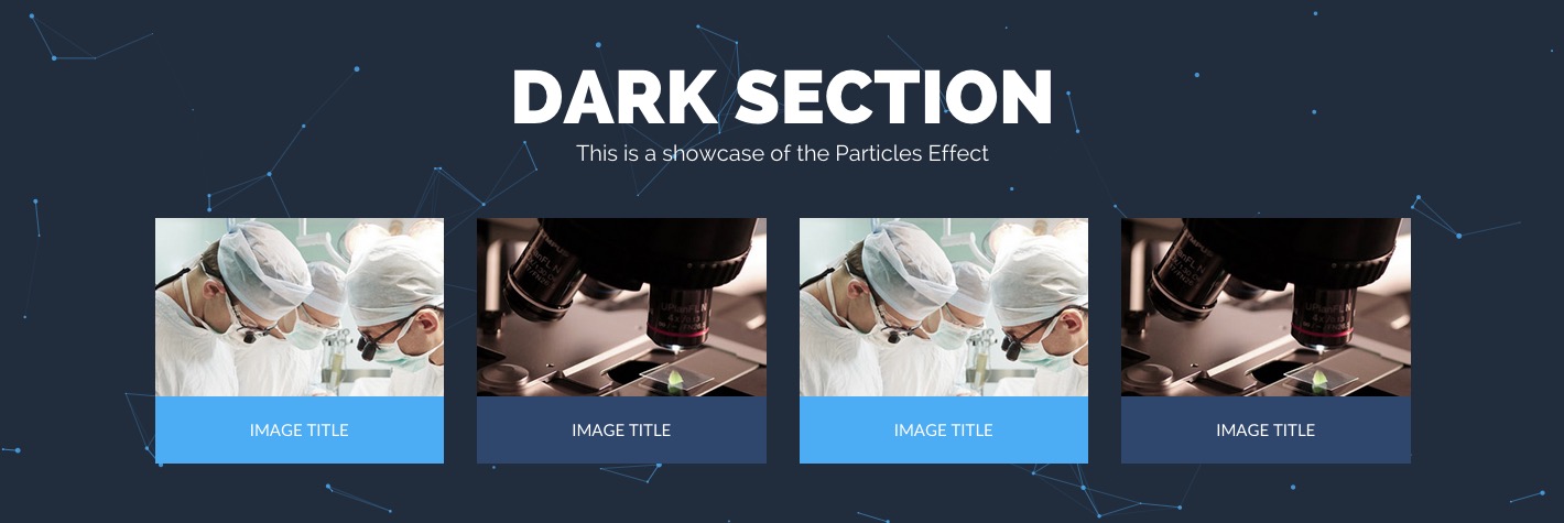
3D Links Hover Effect
If you want to enable a cool 3D effect on your links, all you need to do is add a .roll class
to your anchor tag elements:
3D Links Hover Effect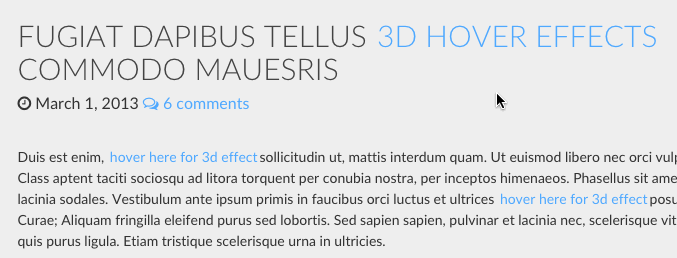
The Portfolio Grid
The Portfolio Grid element currently supports the following types of grid elements: Images, Youtube videos, Vimeo videos, DailyMotion videos, and External links.
You'll need to include two sources for each grid element, in order for it to display a thumbnail and a lightbox image/video or an external link. Here is how you setup each grid element type:
- Images: place the image to be displayed inside the <a> tag and the thumbnail image inside the figure tag as a background image URL:
Portfolio Filtering
Portfolio Grid uses Isotope Filtering for filtering the grid elements according to their category. In order for the grid elements to use category filtering, you'll need to add a special category CSS class in the parent DIV element as follows (diet class refers to the category that this element belongs):
Double Helix Hover Effect
Portfolio Grid also comes with a cool rotating double helix hover effect, enabled by default.
If you want to disable the effect, open the configuration file (assets/js/config.js)
search for themeConfig["DOUBLE_HELIX"] settings section, and switch the enable value
from true to false.
Portfolio Isotope Filtering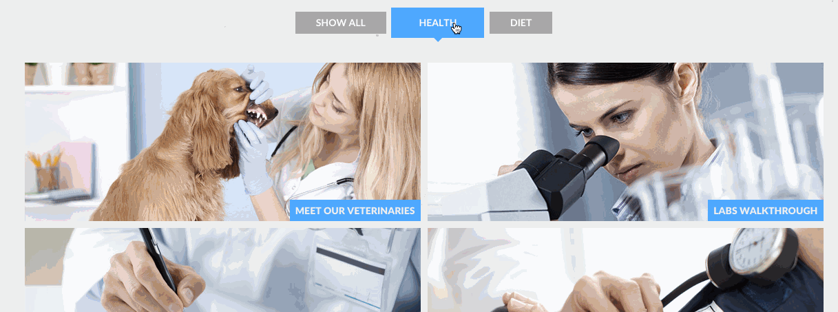
Portfolio Double Helix Hover Effect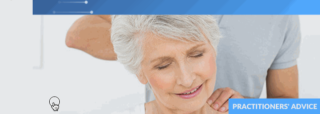
Before After Showcase (Image Compare)
Requirements
The Image Compare plugin is based on the TwentyTwenty jQuery plugin. In order to use it on a page you'll need to ensure you have (1) the jQuery library loaded, and both (2) the twentytwenty.min.css and (3) jquery.twentytwenty.min.js CSS and JS files included as follows:
Usage
You'll need a div container with a class .twentytwenty-container and two img tags
that will contain the before and after images respectively. Each img tag can contain an alt
attribute which will provide the custom text for the Before and After labels. If the alt attribute is
omitted, the default Before and After text will be used:
You can configure each BeforeAfter container using HTML data attributes as seen above: The data-position attribute can be set to either horizontal or vertical, and the data-default_offset_pct attribute, which configures the sliders position, can be set to anything from 0 to 1.
Before After Show Case (Image Compare)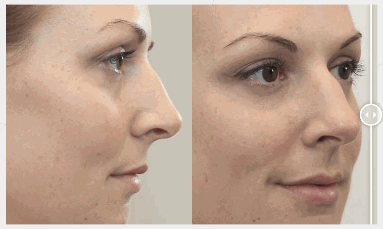
Contact Forms, Appointment Forms, Newsletter
Medicus provides two communication forms: Quick Contact Form and Appointment Form. Both of these forms can be configured by editing the $themeConfig["CONTACT_FORMS"] section found in the config.php file, which can be found in the theme's root folder.
ATTENTION: If you are not receiving the emails sent by either of the contact forms after a successful response, double check your web server's email sending capabilities and/or try using an external SMTP service such as Gmail or Yahoo.
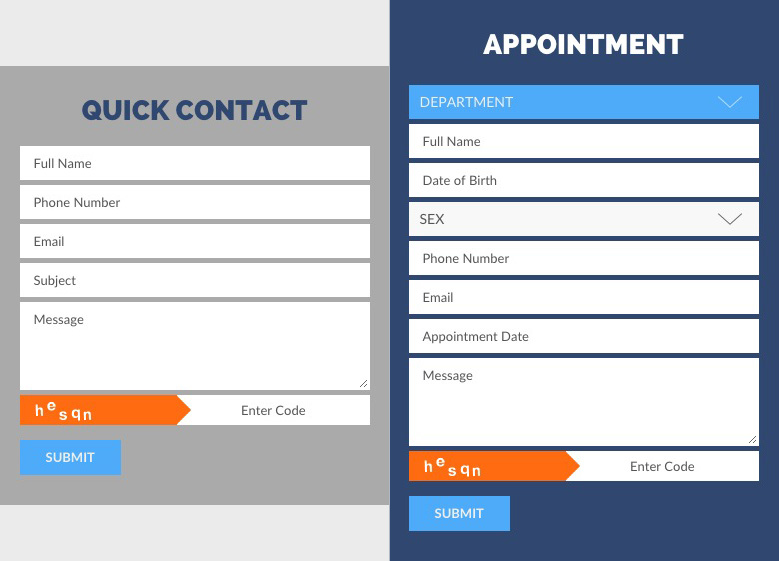
General Configuration: Basic Settings
"TO_EMAIL" : This is the recipient's email address. Use your email address to receive all the emails coming in from the Quick Contact Form and the Appointment Form.
"TO_NAME" : This is the recipient's name, e.g. "Medicus Health Center".
"SITENAME" : Enter your Site's name here, in order to recognize where emails originate from.
General Configuration: Advanced Settings
"TO_EMAIL2" : Enter a 2nd email address that will be also receiving the incoming emails.
"CC_RECIPIENTS" / "BCC_RECIPIENTS" : Add Cc: and Bcc: recipients, separated by commas.
"FORM_TEXT" : By default, the contact form script appends a message at the end of the email body, which informs the recipient that the message was sent from her site's contact form. If you want to remove this message from the emails, set the value of "FORM_TEXT" to false:
"ENABLE_CAPTCHA" : Enable/Disable Captcha codes with true or false. Leave this setting to true to discourage spammers from abusing your contact forms.
USE GMAIL SMTP SERVER
ATTENTION: Before using Gmail's SMTP service for your contact form you have to allow access for a new application by going to the following address: https://accounts.google.com/DisplayUnlockCaptcha
"ENABLE_GMAIL" : Set to true if you plan to use Gmail's email server.
"GMAIL_USERNAME" : Enter your email address at gmail.com.
"GMAIL_PASSWORD" : Enter your gmail password.
USE YAHOO SMTP SERVER
"ENABLE_YAHOO" : Set to true if you plan to use Yahoo's email server.
"YAHOO_USERNAME" : Enter your yahoo email address.
"YAHOO_PASSWORD" : Enter your yahoo password.
Check out this link for more information.
Using SendMail
"USE_SENDMAIL" : Set this to true if you want to use SendMail.
GoDaddy hosting
"ENABLE_GODADDY" : Set the value to true if you're on GoDaddy and experiencing problems sending emails.
Translating Contact Forms to your Language
All of the text strings returned from the Contact forms can be found in the config.php file and can be translated as follows:
Editing config.php
You can directly edit the values contained in the "MESSAGES" and "APPOINTMENT" arrays.
After Translation
ATTENTION: Be sure to translate only the text strings that are contained within "quotes" and retain the special placeholder characters %s and %d.
Newsletter
External APIs
Setting up the Twitter API
Requirements
(1) First of all you need a PHP enabled Web Server.
(2) Then you'll need to create a new Twitter App (or use an existing one) and
(3) grab your oAuth Access Keys and Tokens.
Visit https://apps.twitter.com/, create a new App or select an existing one, and click on Keys and Access Tokens. For more information see this link.
Now, you'll need to enter these values in the config.php file found in the theme's root folder. Search for the TWITTER API section, find the $themeConfig["TWITTER"] array and replace the sample values with your Consumer Keys and Access Tokens.
Configuring Twitter Feed
All of the settings can be found and edited in the themeConfig["TWITTER"] section of the /assets/js/config.js file. Be sure to change, the twitterUserName setting to display your own twitter feed. You'll need to include the following JavaScript files on each and every page you want the Twitter Feed to appear:
- jQuery
- Flexslider Plugin
- tweetie library
- the twitterfeedslider.min.js script
The Twitter Feed is based on the Tweetie jQuery Plugin by Sonny T.
If you need to learn more about LESS, visit LESS
Setting up the Newsletter using Mailchimp API
Requirements
- Host your web site on a PHP Web Server
- Sign up for a MailChimp Account, grab your API Key and a List ID.
- Include the Newsletter JavaScript file /assets/js/newsletter.min.js in your page:
You're now ready to go!
If you would like to translate the Newsletter response messages, e.g. SUCCESS, ERROR, etc. all you have to do is open the /assets/js/config.js file and edit the messages values found in the themeConfig["NEWSLETTERS"] section:
CSS Animations
Medicus uses the Animate.css library to show css animations and wow.js to reveal them on scroll.
In order to animate an object you have to assign animated class to the element and the proper animation class from Animate.css.
If you want to reveal this object's animation on scroll, replace animated with the wow class.
For example, the current section icon animation is achieved by...
Scroll upwards untill this section is well hidden, refresh your browser window [F5] and scroll back down again to see the animation in action.
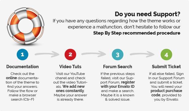
Support
Plethora Themes offers support online through its support suite but you have to register first with your Themeforest Purchase code.