Theme Installation & Updates
Installing WordPress ( if you haven't already... )
Under most circumstances installing WordPress is a very simple process and takes less than five minutes to be completed. Many web hosts (e.g. Bluehost, mediatemple) are now offering tools for automatic installation. However, if you wish to install WordPress by yourself, read about the Famous 5 Minutes Installation.
Below you can find some links about WordPress Installation
Theme Installation through WordPress ( recommended )
After you've downloaded Avoir Theme, unzip the main zip file and you'll find the following:
- documentation - folder containing all documentation HTML files & licenses
- Avoir.zip - Parent theme installation files (ready to use)
- Avoir-child.zip - Child theme installation files (ready to use)
Now what? Follow the next steps to install Avoir as a WordPress Theme.
- Log in to Administration Panel and go to Appearance > Themes
- Select Add New and click Upload
- Click Choose File and locate the Avoir.zip file that you've previously downloaded on your computer *
- Click Install Now
- Select Add New and click Upload once more.
- Click Choose File and locate the Avoir-child.zip this time, which contains the Child Theme.
- Click Install Now
- After Avoir Child is installed, locate it and click Activate..
* Note You should not upload the whole item you have downloaded from Themeforest because you will get an error of broken stylesheet file. Instead locate the Avoir.zip and Avoir-child.zip files found inside the main file you've downloaded.
Warning: while installing your theme through WordPress admin, you may encounter an error message saying : “are you sure that you want to do this?”. This is mainly due to your hosting php settings. Avoir theme zip file is roughly around 6MB and in some hosting configurations the default limit for max upload is 2MB. To solve this problem you should either increase your maximum upload limit (at least to 8MB) on your hosting admin panel, or ask your host to do it for you. This is a common request and they should be able to assist you.
Child Theme Installation ( strongly recommended )
Avoir comes with a child theme included in the theme package. Installing a Child Theme is almost the same as installing any other WordPress theme. The only difference is that you need both the parent theme, and the child theme uploaded to your WordPress theme directory. So, follow the steps described above once more, but now upload Avoir-child.zip instead.
We focus on using the latest web standards and practices regarding WordPress theme development.
We strongly recommend our customers to install the child theme in order to ensure hassle-free updates.
Read all about Child Themes!
Installation Through FTP
If for some reason you had problems installing the theme through wordpress then you can check out the following method:
- Download Health X theme from ThemeForest and unzip the main zip file
- Locate Avoir.zip and extract/unzip its contents
- Use an FTP client (for example FileZilla) to access your host web server
- Transfer your unzipped theme folder to your server in the wp-content/themes/ directory.
- Once uploaded, go to Appearance > Themes and activate your Avoir theme.
- If you consider installing the child theme ( which is strongly recommended ), then repeat the FTP procedure for Avoir-child.zip file and activate this instead.
Plugin Installation
The following plugins are bits of software that extend the functionality of Avoir theme and are included in the theme package. When you install Avoir, you will get a notification message in your WordPress admin informing you about the required and recommended plugins. You have to install them. For those who are not familiar with plugin management, please check WordPress Codex > Managing Plugins reference
-
Plethora Features Library (mandatory)
This is Plethora's theme framework plugin that includes all shortcodes, widjets, custom post types and extra design settings, make sure that is always installed.
-
Visual Composer (mandatory)
Visual Composer allows you to edit your content using an enhanced page builder.
You are expected to use the version included in the package, as it is configured to work seamlessly with the theme.
Please, note that we do not offer compliance with any licensed version of Visual Composer plugin other than the one included in Avoir Package. - Contact Form 7 ( recommended ).
Contact Form 7 can manage multiple contact forms. You can also customize the form and the mail contents flexibly with simple markup. Avoir design is compatible with any form created using Contact Form 7.
Note that for core functionality issues (non related to design), you should refer to the plugin documentation or contact the author directly.
Please, be careful. You have to install and activate Contact Form 7 before importing content!
Update theme
Avoir will be regularly updated to keep up with WordPress updates. So if you get notified about an update, follow the instructions :
- Login into your Themeforest account, go to Dashboad > downloads and download the theme into your computer
- Install an FTP program if you already do not have one (Filezilla is free)
- Retrieve your FTP login information from your hosting admin panel and login into your hosting via FTP
- Unzip the item main file
- Locate theme.zip (e.g. : Avoir.zip) and unzip it. Make sure your unzipping software does not create an extra directory with the same name nested into each other.
- Locate the themes' main folder on your FTP program ( should be something like: "YOUR_HOSTING_ROOT/YOUR_SUBDIRECTORY/wp-content/themes/" ) and drag and drop the local version in it. FTP program will give a warning that there is already a directory with the same name. Choose "replace all".
- It will take from 2 to 10 minutes to replace all files. When you finish, login into your WordPress dashboard, go to Theme Options, and verify the new version. Child theme doesn't need to be updated unless you made no changes to it and want the new cool screenshot.
- On occasion, a TGM notice will appear on top of your administration page to update the "Plethora Themes Features Library" plugin. Update it by clicking on the notice and clicking "Update" and "Activate" under the "Plethora Features Library" listing in the list that appears. Or, on the "Themes" page, click to view Avoir Theme Details and in the popup window, click "Update Plugins" button on the bottom.
The first and most important step to update your theme is to BACKUP your site and Database. There are plenty of ways of doing that. You can start from here: WordPress Backups
Demo Content
Demo Importer
Demo content is very simple using Plethora's Demo Importer!
- Go to Admin > Tools > Avoir Demo Importer
- Click on the demo you like
- You are in the demo import preview screen. Make sure you have installed the plugins required, otherwise the Go To Import Panel button will not be active. If a plugin does not exist, a red coloured title is used, while an orange color will be used instead if a plugin is installed but has not been activated.
- On the import panel screen, click Import Demo and relax while each item is imported. Import procedure might last several minutes, depending on the demo selected
- When the Import Demo button turns green, the import is finished. That's all, enjoy your demo!
Note: if for some reason, you cannot use Demo Importer, you can import our primary demo using the XML/WIE files included in package. For the main content ( XML file ), you have to install the classic WordPress Importer, while for the widgets ( WIE file ) you have to use the Widget Importer & Exporter plugin
Alternative Demo Creation: Use Visual Composer Templates
Apparently, this is the most convenient demo content importing method. We use Visual Composer's functionality to import page templates directly on the editor. To import one of the default demo page templates, follow the instructions :
- Log in to your site administration
- Go to Pages > New
- Fill the title field with the name of the page ( i.e. About Us ).
- Right after the title field, click on Backend Editor button.
- On VC Backend Editor view, click on the templates icon (3rd icon on your left).
- On the Templates pop up window, click on 'Default Templates' tab.
- Now you should see a list with all default templates. Click the one you need ( i.e. 'About Us Page' ). After a couple of seconds, you will see the editor on the back filled up with content boxes.
- Close the 'Templates' popup window and click on the 'Publish' button on your right to save your page...and that was all!
When using this method, you should expect some issues with elements that use demo image/url reference values. Don't panic...you can just edit these demo references using the VC editor.
Basic Theme Setup
Set up a static Front Page / Posts page
Administration > Settings > Reading > Front Page Displays
By default, WordPress displays latest posts in the Front Page. You should change this behavior by setting up a different static Front Page / Posts Page instead:
- Add a new page to use it as Front Page. You should give a distinctive name ( e.g. Home or Welcome )
- Add another new page to use it as Posts Page. You should give a distinctive name ( e.g. Blog or News ). This page will be selected as your static blog page.
- Go to Administration > Settings > Reading > Front Page Displays > Front Page
- Change your Front page display to a static page
- Select the first page you created for Front Page
- Select the second page you created for Posts Page
- Click the Save Changes button...you are ready!
Important note:. You can configure your blog options now on Theme Options > Content > Blog ( check Blog Options section below for further instructions ).
Favicons
Theme Options > General > Favicon
Add your site's favicon following the steps below:
- Upload a classic 16x16 px image ( PNG/GIF or ICO ). This will be the classic favicon used by all desktop browsers
- Upload a 32x32 px image ( PNG/GIF or ICO )
- Upload a 96x96 px image ( PNG/GIF or ICO )
- Click Save Changes
Since 4.3 version, WordPress introduced a site identity feature where you can place a single 512x512 image and just let WP handle all your application icon displays. We suggest going along with this native WP feature, nevertheless we kept these options here for older WP versions
Color Sets
Theme Options > General > Basic Colors & Sets
Basic Colors
These are the default colors, which are applied natively on several design elements when a color set is not applied OR cannot be applied. They are:
- Body Background - the main page background color.
- Text Color - the default text color ( headings and content text ).
- Link Text - the default links text color ( normal & hover ).
- Primary Brand Color - this is your primary BRAND color.
- Secondary Brand Color - this is your secondary BRAND color.
Primary/Secondary Color Sets
These are the most important color sets, as they use by default your primary/secondary brand colors as their background. In addition, you can define a separate text & link text configuration for each color set.
Additional Color Sets
These color sets, along with Primary & Secondary, can also be applied to several layout elements. They are named after their default coloring, however this should not prevent you from giving them alternative feel, according to your needs:
- Dark
- Light
- Black
- White
The color set concept
All design elements contain four important colors that form their core styling:
- The background color
- The text color
- The link text color
- The link mouse hover color
This color combination is defined as a 'color set'.
When a color set is applied to a layout element ( i.e. a row or a column ), this element inherits the background, text and link text color of its color set configuration.
Designer Tip
We always recommend working with no more than two color sets on a single page ( i.e. primary and secondary OR dark and light )...unless you are fond of pages like this
Typography
Theme Options > General > Typography
On this theme options section, you may configure the following:
- Primary Font, the font family used in content texts
- Secondary Font, the font family used in headings, menu items and buttons
- Font Size Base, which will adjust all body and paragraph text elements font sizes according to this value
- Supplementary Font Size Base, which will adjust all logo, menu, heading and button text elements font sizes according to this value
- Heading Text Transform affects all headings letter cases ( uppercase, lowercase, etc. )
- Heading Font Weight affects all headings font weight ( normal, bold, etc. )
- Buttons Text Transform affects all buttons text letter cases
Social Icons
Theme Options > General > Social Icons
On this section, you can manage the website's social icons index. Every other feature that utilizes social icons, will use the social links that you will define here.
You may create as many social icons you like, using the 'Add social icon'. For each icon, you have to setup the following:
- Title, the social network's reference title ( ie. Twitter )
- Icon, the social network's icon
- Link, the link to your social profile.
Apart from the social icons, there are also some additional:
- Contact icons ( you may use a mailto link )
- Skype contact icons ( you may use a callto link )
- RSS icons ( you may use a feed link )
Miscellaneous Options
Theme Options > General > Misc
In this section, you can configure some global options, such as:
- Diagonal Design Angle. Configure the angle degrees of the Avoir distinctive diagonal design pattern, used in several elements throughout the theme. Notice that this option affects ALL the displays of this design
- Transparency, which affects the transparency level for all elements that utilize it. Notice that a few elements ( such as header section transparency ) have separate options to configure their transparency level
- Back To Top, which enables/disables the back to top icon
Header Setup
The Header consists of two main subsections:
- The Main section, which contains:
- the logo,
- the main navigation
- and the social bar
- The Top Bar section, which consists of 2 columns that both of them can contain a secondary menu or a simple text
Override Header/Footer
You can customize your header/footer on the corresponding tabs of your Theme Options panel. You also have the possibility to override per-page most options of the global configuration ( check Header/Footer settings on your edit page options ). This will allow you to customize as you like the header/footer for a special single page implementation ( i.e. a promotion landing page or an one-pager presentation )
Main Header Section
Theme Options > Header > Main Section
On this tab, you can setup the look and feel of your header's main section. Depending on your choice, you can:
- Add an Angle Positive bottom separator, which is the angle effect you may review on the demo page.
- Set Transparency to 'On', if you want a transparent background. If is set to 'On', you may also set the opacity level
- The header position on page scroll, where you can choose between a sticky ( always visible ) or a fixed-on-top position ( disappear on scroll )
Header Color Sets
This is a special color set that affects exclusively the header section. Other than this, the concept is the same as the rest color sets.
If you choose a solid color set background, the header will use the background color defined on the Header Color Set ( check General > Basic Color & Sets )
Header Main Section // Logo
Theme Options > Header > Main Section // Logo
Add your logo following the steps below.
- Choose one of the 4 available layouts:
- Image only
- Image + Subtitle
- Title + Subtitle
- Title only
- Upload your logo ( if your layout requires image )
- Set your logo title ( if your layout requires title )
- Set your logo subtitle ( if your layout requires subtitle )
- Enable animation for the subtitle
- Set logo positioning ( depending on your logo size )
- Click Save Changes
Header Main Section // Menu
Theme Options > Header > Main Section // Menu
In this section, you may configure all main navigation options, such as:
- Main Menu Location, which sets the default menu location for all your pages. You may override this on any page where a special menu is needed on this position
- Multi Level Menu Behavior, which allows you to switch the action trigger ( mouse hover or click) for displaying submenu items
- Menu Item Font Size, where you can set the font-size for your menu items text
- Menu Item Vertical Padding options, which allow you to change the menu items vertical padding ( left + right ) for any screen display
- Menu Item Horizontal Padding options, which allow you to change the menu items vertical padding ( top + bottom ) for any screen display
Create the Main Menu
Creating WordPress Menus is an easy procedure. Follow the steps described below and you will create your first menu in no time! Have in mind that you should create pages, posts, portfolio items, etc. before adding them to the menu.
- Login to the WordPress Dashboard
- From the Appearance menu on the left-hand side of the Dashboard, select the Menus option to bring up the Menu Editor.
- Select Create a new menu at the top of the page
- Enter a name for your new menu in the Menu Name box
- Click the Create Menu button
- Click the Save Menu button
Create a Super Menu
- Go to Appearnce > Menus
- Select the Menu that you want to work with
- Click "Screen Options" and Check "CSS Clashes"
- Go to parent menu item and select "two column drop left" from the dropdown list
- Place your submenu items and select "single column" from the dropdown list
What Is A Menu Location?
A menu location ( or navigation location or theme location ) is every theme position that is set to display a navigation menu (i.e. Primary Navigation, Top Bar Navigation, etc. ). When a menu is created on Appearance > Menus, you HAVE TO assign it on a specific theme location in order to be displayed on your website.
Dynamic Navigation Locations
The usual workaround of theme authors is to configure one menu location for each menu display position. On Plethora Themes, we give the possibility to create additional menu locations dynamically and select the one you want for each position. You will find this useful when you might need, let's say, a diffent primary navigation for a specific promo landing page or for a one-pager implementation...otherwise, just leave the defaults!
Header Main Section // Social Bar
Theme Options > Header > Main Section // Social Bar
The social bar feature refers to the social icon on the right of your main navigation, which when clicked displays a floating social icons bar. On this section, you may configure the social bar options:
- Floating Social Bar switch, will enable/disable the social icons bar feature on all website pages. Remember that if this is set to 'Hide', all of the rest options will disappear!
- Icons Display Status, will display a list with the predefined social icons index that you have already setup under the General > Social Icons tab. Using this option, you may enable/disable some icons of your predefined index especially for this social feature.
Header Top Bar
Theme Options > Header > Top Bar
In this section, you may enable and configure the top bar feature options:
- Top Bar switch, will enable/disable the top bar feature on all website pages. Remember that if this is set to 'Hide', all related options will disappear too!
- Set Transparency to 'On', if you want a transparent background. The transparency level can be configured on General > Miscellaneous
- Top Bar Layout, defines the desired layout as it appears on the icon options.
Depending on your layout choice ( check above ), another one or two option sections will appear below for additional column configuration. These column options include:
- Content Display, whether you want this column to display a menu OR text
- Menu Location, if you choose to display a menu in this column, you will be asked to set a menu location here.
- Display Text, if you choose to display a text in this column, you will be asked to write your text on this textarea field.
- Content Alignment, allows you to align each column's content as you like
- Visibility Behaviour, sets the MINIMUM screen resolution for this column to be visible. This is very useful for those that don't want the top bar to be displayed on smaller screen displays. Leave this empty if you want it to be displayed on all screens
Top Bar Color Set
This is a special color set that affects exclusively the top bar section. Other than this, the concept is the same as the rest color sets.
Footer Setup
The Footer consists of two main subsections:
- The Main section, which can contain up to four widgetized areas ( or sidebars if you prefer ), where you can place any widget(s) you prefer.
- The Info Bar section, which consists of two columns, one for your copyright text and another one for your credits text...of course you can use these text fields as you like!
Both Main Footer and Info Bar section, can be enabled/disabled globally OR on a per page basis.
Override Header/Footer
You can customize your header/footer on the corresponding tabs of your Theme Options panel. You also have the possibility to override per-page most options of the global configuration ( check Header/Footer settings on your edit page options ). This will allow you to customize the header/footer as you like, for a special single page implementation ( i.e. a promotion landing page or an one-pager presentation )
Main Footer Section
Theme Options > Footer > Main Section
On this tab, you can setup the layout along with the look and feel of your footers's main section. You can leave the default angle gradient background or choose a solid color background. Depending on your choice, you can:
- Main Footer Section switch, will enable/disable the main footer on all website pages. Remember that if this is set to 'Hide', all related options will disappear too!
- Add an Angle Positive / Negative top separator, which is the angle effect you may review on the demo page.
Apart from the styling options, you can also define the widgetized areas layout. Specifically, you can set:
- Widget Columns layout, that apart from the display layout, will also define the number of widgetized areas
- Column 1-4 Widgets Area, gives you the possibility to define a different widgetized area for each column of your chosen layout
Footer Color Set
This is a special color set that affects exclusively the footer section. Other than this, the concept is the same as the rest color sets.
If you choose a solid color set background, the footer will use the background color defined in the Footer Color Set ( check General > Basic Color & Sets )
Footer Info Bar
Theme Options > Footer > Info Bar
On this tab, you can setup the bottom info bar display:
- Footer info bar, will enable/disable the display of the info bar. On disable, all the remaining option will disappear
- Color Set, the selected color set ( background/text/link colors ) that will be applied to the info bar.
- Transparency film should be set to 'On', if you want a transparent overlay. The transparency level can be configured on General > Miscellaneous
- Copyright text, is the text that will be displayed on the left side of the info bar
- Credits text, is the text that will be displayed on the right side of the info bar
Content Pages
Before start working individually with your content pages, pay attention to some useful tips/info that will surely help you quickly understand how you can work more efficiently with Avoir.
Import the demo content
Using the demo content pages, is the best way to elaborate faster with our content pages. Nevertheless, you should not stuck with it...Avoir is full of customization options that you can use in order to produce impressive and unique page presentations on your own...so be creative!
Understand the options override system on content pages
There are two places where you can configure your content options:
- The Theme Options Panel, which contains the default option setup for each content page type. This means that you can configure the default options that are applied when you create a new single post ( such as a page, a post, a terminology article or a profile page ).
- The Post Options / Page Options boxes, which are displayed on every new/edit post/page screen. Most of the default options that you set on Theme Options Panel, can be overriden on these Post Options / Page Options areas. This allows you to create some unique page setups...let's say a special promo landing page or a blog article that you want to be styled differently than others.
What you have to remember here is that changing a default value on Theme Options panel does not necessarily affects options that were customized per post/page. Some practical examples on this:
Example 1:
Option: page layout, a page option that accepts one out of 3 given values: 'full width', 'right sidebar' ( default value ) or 'left sidebar'
Pages status BEFORE default value update: you have created 5 'full width' pages, 25 'right sidebar' pages ( default value ) and 10 'left sidebar' pages
Default value update: switched default value 'right sidebar' to 'left sidebar'
Pages status RIGHT AFTER default value update: 5 'full width' pages, 0 'right sidebar' pages and 35 'left sidebar' pages ( default value )
What happened: The default 25 'right sidebar' pages converted into 'left sidebar', while the 5 'full width' pages, that were customized per page were left in tact.
Example 2:
if you update, on Theme Options panel, a previously default "Display Title" to "Do Not Display Title", this will stop displaying the title for all posts. This affects all post behaviour, as this a simple update of a two state option ( on/off ).
Set up your blog page options
Theme Options > Content > Blog
Blog Page Options- Choose Page Layout
- Select Sidebar
- Choose to display or not Title on Content
- Write your Default Title
- Taxonomy Subtitle > Select to display Default Title or Taxonomy Title
- Author Subtitle > Select to display Default Title or Author Display Name
- Author Subtitle > Select to display Default Title or Selected Date
- Choose to display or not Subtitle on Content
- Write your Default Subtitle
- Taxonomy Discription > Select to display Default Subtitle or Taxonomy Description
- Author Bio > Select to display Default Subtitle or Author Bio
- Select to display Default Subtitle or leave Empty
- Select Post Catalog Type Layout
- Select Featured Media Display Behavior
- Content/Excerpt Display > Choose to display Excerpt or Content
- Choose to display or not Subtitle
- Choose to display or not Categories info
- Choose to display or not Author info
- Choose to display or not Date info
- Choose to display or not Comments Count info
- Choose to display or not Read More Button
- Write your Button Text
- Write your "No post where found Text
- Write your No post description Text
- Save Changes
First things first! Before start working with your content pages, please make sure that you have set static pages for your basic front displays: the Front page and the Posts page. Need some instructions? Click here!
Set up your pages options
Theme Options > Content > Pages
Page Options- Select Page Layout
- Choose to display Title or not
- Choose to display Subtitle or not
- Choose to One Page Scrolling Speed to affect the smooth scrolling speed. Very useful for single page implementations that contain lots of shortcode sections.
- Save Changes
Set up your single posts options
Theme Options > Content > Posts
Single Posts Options- Choose Single Post Layout
- Choose Single Post Side Bar
- Select to display or not Title
- Select to display or not Subtitle
- Select Media display Ratio
- Select to display or not Categories Info
- Select to display or not Tags Info
- Select to display or not Author Info
- Select to display or not Date Info
- Select to display or not Comments Count Info
- Save Changes
Set up your profiles options
Theme Options > Content > Profiles
Single Profile Posts Options- Choose Profile Page Layout
- Choose Profile Content Layout
- Choose Profile Content Color Set
- Select to display or not Title
- Select to display or not Subtitle
- Select to display or not Author Posts
- Chosse Profiles Social Icons
- Specify a Custom Permalink for profile posts
- Save Changes
Set up your terminology articles options
Theme Options > Content > Terminology
Single Terminology Posts Options- Select Layout
- Choose to display Title or not
- Choose to display Subtitle or not
- Choose to display Topics Info or not
- Choose to display Author Info or not
- Choose to display Date Info or not
- Specify a Custom Permalink for terminology posts
- Save Changes
Set up your 404 page options
Theme Options > Content > Posts
404 Page Options- Select and upload your featured 404 image
- Write your Title
- Write your Subtitle
- Write your Additional Title on content
- Write your Content
- Choose to display or not Search Field
- Write your Search button text
- Save Changes
Set up your search page options
Theme Options > Content > Posts
Search Page Options- Select Page Layout
- Select Sidebar
- Choose to display or not Title on Content
- Write Title Prefix
- Choose to display or not Subtitle on Content
- Select and upload your featured search page image
- Save Changes
Shortcodes
Working with the Visual Composer page builder
Visual composer is a popular Page Layout building plugin configured to work together with Plethora framework. It will help you manage Plethora's shortcodes and create different and unique layouts without coding.
Please, note that we do not offer compliance with any other licensed versions of Visual Composer plugin apart from the one included in the Avoir Package.
VISUAL COMPOSER | OVERRIDING SHORTCODE
COPY FROM /js_composer/include/templates/shortcodes/
TO
/Avoir/templates/shortcodes/
Working with rows & columns
Adding rows & columns in Health X is one of the most basic and useful group of options, if you want to create your website with the demo standards. You can easily create different combinations just by setting rows and columns.
Row Settings- Choose Color Set
- Choose Background Type
- Choose Transparent Overlay Type
- Choose Text Align
- Enable or Disable Full Width
- Enable or Disable Full Height
- Select Row Padding Setup
- Select Columns AlignmentType
- Enable or Disable Columns Padding
- Enable or Disable Elevate Row
- Enable or Disable Particles Effect
- Enable or Disable Particles Effect
- Set an Extra Class
- Set a Row id
- Save Changes
- Set Column Width
- Choose Color Set
- Choose Background Type
- Select Transparent OverlayType
- Enable or Disable Boxed Design
- Set Heading Title
- Select Heading Alignment
- Select Content Content Alignment
- Enable or Disable Elevate Column
- Select to Equalize or not Column Height
- Set an Extra Class
- Save Changes
How to add Shortcodes
Avoir comes with 15 shortcodes that allow you to create unique layouts using many different combinations.
How to use shortcodes in the Backend Editor:- Open a page and choose BACKEND EDITOR.
- Click "Add element" button (The one with the cross symbol).
- Select the shortcode that you wish to add from the list.
- Make your selections from the loaded shortcode options and click "save".
- Update your page and you are ready
Button Shortcode
- Write your Button Text
- Set Button Link
- Select Button Size
- Choose Button Alignment
- Choose Button Styling
- Choose to activate or not Button Icon
- If you select to activate "Button Icon", you should select an icon from the list that appears as well as Button Icon Alignment
- Save Changes

CF7 Form Shortcode
- Go to Contact > Add New and create a new contact form using Contact Form 7. Below you can find the code for Appointment and Quick Contact.
- Set title or leave this area blank if you don't need a title
- Select previously created contact form from the drop down list
- Select form type
- Save Changes
<p>[select* menu-919 "Department" "Pathology" "X-Ray" "Gynecology"]</p>
<p>[text* name placeholder "Full Name"]</p>
<p>[text* birthdate placeholder "Date of Birth"]</p>
<p>[select* sex "Sex" "Female" "Male" "Child" ] </p>
<p>[text* telephone placeholder "Phone Number"]</p>
<p>[email* email placeholder "Email"]</p>
<p>[text* date placeholder "Appointment Date"]</p>
<p>[textarea message x4 placeholder "Message"] </p>
<p>[captchac captcha-950] [captchar captcha-950 placeholder "Enter Captcha"]</p>
<p>[submit "Submit"]</p>
Code for QUICK CONTACT FORM
<p>[text* your-name placeholder "Full Name"]</p>
<p>[tel* tel-915 placeholder "Phone Number"]</p>
<p>[email* your-email placeholder "Email"]</p>
<p>[text your-subject placeholder "Subject"]</p>
<p>[textarea your-message x4 placeholder "Message"]</p>
<p>[captchac captcha-960] [captchar captcha-960 placeholder "Enter Captcha"]</p>
<p>[submit "Send"]</p>
Heading Group Shortcode
- Set your Heading Title using WP editor
- Set your Heading Subtitle
- Upload your Masked Heading Image
- Save Changes
Image Compare Shortcode
- Select and Upload Before Image
- Select and Upload After Image
- Set the Default split Offset
- Choose Effect's Orientation
- Save Changes
Newsletter Form Shortcode
- Set the text that will appear in the email field placeholder
- Set the text that will appear in the subscribe button
- Choose to Enable or Disable SVG Newssleter Template
- Save Changes
Pricing Plan Shortcode
- Select to display or not "Image on Top"
- Set title
- Set Subtitle
- Choose color setup for the icon section
- Select to display or not vector background pattern
- Set Price Amount
- Set Price cycle
- Save Changes
Profiles Grid Shortcode
- Select the profiles you want to be dispayed
- Select how many profiles you want to be displayed in the grid
- Choose "Order By"
- Select to display or not "Feature Image"
- Choose a color Setup
- Select to display or not Excerpt Text
- Select to display or not Social Icons
- Select "Link to"
- Set the Link Button Text
- Save Changes
Teaser Box Shortcode
- Set Title
- Set Subtitle
- Write your content using basic HTML Tags (If needed)
- Select Media Type and upload your image or select your icon
- Set media Link URL
- Set media section color
- Set media display ratio
- Set text section color
- Save Changes
Terms Index Shortcode
- Select a Terms Topic
- Set post link behavior
- Select to open in a new window or not
- Save Changes
Testimonials Shortcode
- Select Testimonial Category to choose specific testimonial posts or leave empty to get uncategorized testimonials
- Save Changes
HOW TO | RECREATE TESTIMONIAL SLIDER SECTION
1. Create 2 Testimonial Slides (Custom Post Type)
2. Add New Page > VC > Add Row >
Class: secondary_section
Custom Layout: 2/12 + 8/12 + 2/12
3. Add Testimonial Shortcode in middle Column (Testimonial Categories: Optional)
4. Add Heading Shortcode on top of the Testimonial Shortcode in the middle Colum
Heading: H3 > Hear what our patients say
Subtitle: Subtitle: Testimonials Slider Feature
Twitter Feed Shortcode
- Set the number of tweets to be displayed
- Enable or not Replies
- Enable or not date in the twitter feed
- Save Changes
Widgets
About Us Widget
- Set your Logo
- Enter your Title
- Enter your Description
- Enter your Business Address
- Set Google Map URL
- Enter your Telephone Number
- Enter your Business email
- Set your Website URL
- Put your URL in every social media you want to be displayed
- Save
Contact Form Widget
- Choose Form Type
- Set your Title
- Set Contact Form id
- Save
Flickr Feed Widget
- Set your Title
- Choose how many photos you want to be displayed
- Set Flickr id
- Save
Latest Blog Posts Widget
- Set Title
- Choose Blog Category
- Set the number of the posts you want to be displayed
- Save
Multi Box Widget
- Set your Title
- Choose Title Alignment
- Write your Content
- Choose Content Alignment
- Choose Color Set
- Upload a background Image
- Set verical alignment for your background image
- Add a transparent overlay
- Apply a special boxed design, that will add padding to your content
- Choose a "Wow Animation"
- Add your own style classes, for easier custom styling
- Save
- Set Title
- Upload Background Image
- Set Button text or leave it empty if you want to remain hidden
- Set Button Link
- Choose Icon
- Add extra Row
- Save
The Media Panel
Setup A Simple Solid Color Panel
You can choose different settings for your Head Panel in every single page
- Choose Background Type
- Select Title & Subtitle Behavior
- Select Headings Size
- Choose Title Color Set
- Choose Title background type
- Select Subtitle color set
- Select Subtitle background type
- Select Title & Subtitle align
- Update
Setup An Image Panel
You can choose different settings for your Head Panel in every single page
- Select feature image or select and upload a new image
- Choose Title & Subtitle behavior
- Select Headings Size
- Select Heading Layout
- Choose to enable or not Parallax Effect
- Select Vertical Align
- Select if you need Full Height or not
- Update
Setup A Slider Panel
You can choose different settings for your Head Panel in every single page
- Go to Sliders > Add New and create a new slider
- Select Slider from the dropdown menu
- Select if you need Full Height or not
- Update
Setup A Google Map Panel
You can choose different settings for your Head Panel in every single page
- Set Map Latitude
- Set Map Longtitude
- Choose Map Type
- Set Map Zoom
- Choose if you need Map Marker or not
- Select Marker Type
- Edit information window that appears on marker click
- Choose to display or not Map Type selection Control
- Set Map type control position
- Set Map type control style
- Choose to display or not Map pan control
- Set Map pan control position
- Choose to display or not Map zoom control
- Set Map zoom controlposition
- Set Map zoom control style
- Choose to enable or disable Map Scrolling Wheel
- Choose to enable or disable Snazzy Map styling
- Select Title & Subtitle behaviour
- Choose Heading Size
- Select Headings Layout
- Choose to enable or disable Full Height
- Update
Supported APIs
Set up your MailChimp API
Theme Options > Add-ons & Modules > MailChimp Api
If you don't have a mailchimp account, visit mailchimp and sign up for one. Then, you have to generate your api key and find your find your list id. Copy and paste it to the admin required fields.
Set up your Twitter API
Theme Options > Add-ons & Modules > Twitter Api
To setup the Twitter Feed, you should first create a new Twitter Application and obtain the necessary API Credentials, under Your App Name > Keys and Access Tokens. These settings are all you need to make the feed work.
For Advanced Users & Developers
Scripts & Styles
Set Custom CSS Rules
We strongly recommend placing you custom CSS rules on the child theme's main stylesheet ( style.css ).
Nevertheless, you may place your custom CSS in this field too. These rules will be loaded on every page of the website.
Please be careful: DO NOT wrap your CSS inside <style> tags, as this is done automatically
Set Custom Javascript
You may place your custom JS in this field. Scripts, set in this field, will be loaded on every page of the website. Please be careful, do not <script> wrap your JS code, as this is done automatically
Setup Google Analytics
- Go to Google Analytics Signup Page and create (if you don't have already) a Google account
- When you sign in your account you have to choose between website or mobile app. Make sure website is selected.
- Enter your website's url, account name, country etc.
- Click on the get tracking ID button
- Copy this tracking code and paste it in Google analytics options section.
- Choose if you want the analytics script to be loaded on page head or footer ( usually should be on footer )
Custom Nav Locations
Theme Options > Advanced > Navigation Locations
This tool allows you to create navigation locations dynamically. In combination with this theme's flexible menu location options, you have the possibility to create pages with totally different navigation
Custom Sidebars & Widgetized Areas
Theme Options > Advanced > Custom Sidebars
This tool allows you to create sidebars dynamically. In combination with this theme's flexible sidebar options, you have the possibility to create pages with totally different widgetized areas
WebFont Icon Libraries
Theme Options > Advanced > Icon Libraries
Manage all your icon font resources. All parsed icons will be available on every icon picker field you will meet on various features ( theme options, shortcodes, etc. ).
Preset Icon Libraries
These are the predefined icon libraries that usually include 99% of the icons you'll' need on the specific theme niche. You cannot delete these libraries, but you can deactivate them.
Your Icon Libraries
Apart from the preset ones, you may easily upload your own icon font libraries and have these icons available on the same features as the preset ones.
Please follow these instruction to upload your custom icon library
- Download the desired icon font library on a folder on your computer. Make sure that the package includes the font file(s) ( EOT, SVG, WOFF, etc. ) and a CSS stylesheet that includes all CSS rules for the icons included on font files
- Switch Activate Library to On
- Give a distinctive and unique Slug, for the library ( e.g. fa for Font Awesome)
- Give a Reference Title, which will be used only for display purposes ( e.g. Font Awesome )
- Give an Icon Parsing Prefix / Suffix. You can find the icon parsing prefix/suffix by opening your library stylesheet that includes all CSS rules for the icons. Open this file on a text editor and spot out the icon rules... for example, Font Awesome icon rules look like this:
.fa-glass:before { content: "\f000"; }
.fa-music:before { content: "\f001"; }
.fa-search:before { content: "\f002"; }
.fa-envelope-o:before { content: "\f003"; }
.fa-heart:before { content: "\f004"; }
.fa-star:before { content: "\f005"; }
.fa-star-o:before { content: "\f006"; }
The green highlighted part is the icon parsing prefix ( fa- // don't use the dot! ), while the blue one is the suffix ( :before ). Usually, the prefix is diffent from library to library, while on the 90% of the cases the suffix is :before. - Select your Icons CSS Stylesheet, to be uploaded
- Select your EOT Font File to be uploaded ( if supported by your library )
- Select your SVG Font File to be uploaded ( if supported by your library )
- Select your TTF Font File to be uploaded ( if supported by your library )
- Select your WOFF Font File to be uploaded ( if supported by your library )
- Select your WOFF2 Font File to be uploaded ( if supported by your library )
- Select your OTF Font File to be uploaded ( if supported by your library )
- Set the Font Style. For most of the libraries this should be left to 'normal'
- Set the Font Style. For most of the libraries this should be left to 'normal'
- Set the Font Style. For most of the libraries this should be left to 'normal'
- Click Save Changes and your library will be uploaded and ready to be used on your theme. You may review your library by clicking the Preview all ACTIVE icons link, below the preset libraries accordion ( make sure to refresh the page before this )
You may enable/disable any of these libraries. Nevertheless, you should know that Font Awesome icons are broadly used in this theme and deactivating them should only be done for important reasons.
Pre-installed Icon Libraries
USEFUL TIP
You may use the Fontello Icon Fonts generator service to produce your icon collections and import them later on your Plethora theme! Please, first read the pop up instructions included on the theme options page ( this is the "Please read this before start working with icon libraries" link ), as this will help you produce an easy Fontello icon font export
Activate / Deactivate Theme Features
Developer Tools
Supported Plugins
Visual Composer
Visual composer is a popular Page Layout building plugin configured to work together with Plethora Features Library. It will help you manage Plethora's shortcodes and create different and unique layouts without coding.
Please, note that we do not offer compliance with any other licensed versions of Visual Composer plugin apart from the one included in the Avoir Package.
Contact Form 7 Support
Contact Form 7 can manage multiple contact forms. You can also customize the form and the mail contents flexibly with simple markup. Avoir design is compatible with any form created using Contact Form 7.
Note that for core functionality issues (not related to design), you should refer to the plugin documentation or contact the author directly.
Please, be careful.
You have to install and activate Contact Form 7 before importing content!
WPML & Multilingual Support
Avoir is a "Translation Ready" theme. This means it can be easily translated to any language by using the build-in Wordpress way of translating themes, using .po and .mo files. But if you need a multilingual site, Avoir is also "WPML Ready", fully compatible with the WPML plugin.
Theme translation using .po and .mo files
This is a straightforward tutorial that will help you translate a Plethora WordPress theme into the language of your choice. Keep in mind that this is the suggested procedure for a localized website ( single language ). If you need a multilingual website, then you should consider moving to the next section about WPML.
Software/resources needed
The only thing you need is a Gettext translations editor. On this tutorial we will use Poedit editor, which is one of the best out there. It is available for both Mac and PC, and it’s free!
Things to know about PO/MO/POT files
All Plethora themes are translation-ready and come with the related Gettext files (PO/MO and POT files). Consider these files as a catalog containing every single text string used on your theme. What you need to know about them:
- PO files are the files which contain the actual translations. Each language will have its own PO file, for example, for French there would be a fr.po file, for German there would be a de.po, for American English there might be an en_US.po.
- MO files are the compiled versions of PO files and they always have to be together. In our case, you won’t have to deal with it, as it is created automatically by Poedit.
- POT files are basically the template files for PO files.
- You can find these files n the /language/ folder under your Plethora theme’s root directory
Fine…let’s translate!
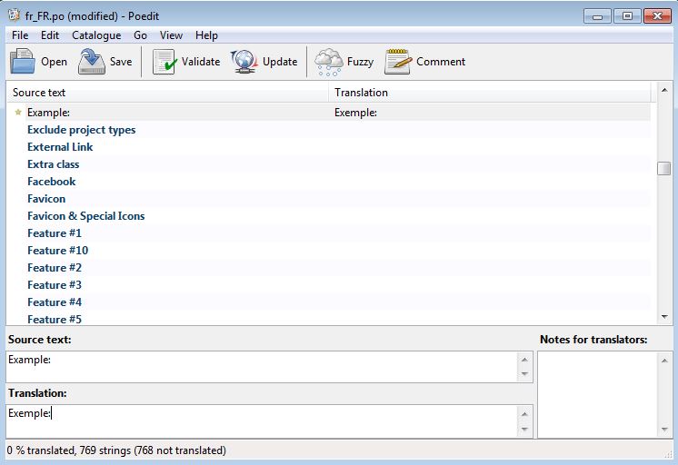
- Open the POT file with Poedit.
- Go to File > Save as and save your PO language file. As stated above, it is very important that you should name this file using your two letter language code. You can find your country and language code here. For example, a French translation for France should be saved as fr_FR.po, an Egyptian Arabic translation should be saved as ar_EG.po, and an English translation for the United Kingdom should be saved as en_UK.po.
- Now you are ready to translate your theme. Poedit lists all translatable strings and you can click on any string to translate it. There are three default boxes below the list. One for the original source text, a second one for the translation and a third one that can include notes for translators. Every time you save your file, Poedit will automatically compile a .mo version of the file in the same directory.
- After finishing your translation ( it works even if you have not translated all strings ), upload these files to your /language folder using FTP.
-
If you are already using WordPress in the same language as your theme’s translation files, then WordPress will automatically pick up translation files for your theme. However, if you are using WordPress in default English, then you can still force WordPress to use your translated files by adding this line of code in your wp-config.php file:
Note: Replace fr_FR with your language and country code:define ('WPLANG', 'fr_FR');Note that after WP 4.0 you may select your default language during the installation procedure or under Settings > General in the Dashboard.
Are you working on a child theme?
Those working with child themes ( kudos to you ), will already have a question in their minds…and the answer is YES! If you translate the PO/MO files on your parent theme, you will lose it on the next theme update. Relax, you may implement your translations on the child theme as well. Just follow these instructions:
- Copy /languages folder from your parent to the child theme directory. On child theme, rename the files with .po/.mo extensions according to your locale ( ie. de_DE.po / de_De.mo for German installations ).
-
Put this code into your child theme’s functions.php:
add_action('after_setup_theme','plethora_child_translation'); function plethora_child_translation() { load_child_theme_textdomain( 'plethora-theme', get_stylesheet_directory() . '/languages' ); } - Work with your PO/MO/POT files as referenced above in order to translate your website.
Make your site multilingual with the WPML plugin
Avoir is "WPML Ready", fully compatible with the WPML plugin. It comes with a wpml-config.xml that renders all custom fields, posts, taxonomies and admin fields translatable.
First, you need to to purchase a recent version of WPML, including the String Translation and Translation Management modules.
Initial Setup
- Install and activate the core WPML plugins (WPML Multilingual CMS, WPML String Translation, WPML Translation Management), and then other WPML plugins that may depend on them.
- Set up WPML from WPML->Languages. See WPML Getting Started Guide for complete reference, but the initial simple three-step setup is self-explanatory, asking you to choose your default language, a set of active languages, and a language selector.
Translating Pages, Posts and other post types
To translate a page you need to go to Wp admin – Pages and in the list you will see columns for each active language, with a pencil icon (for ‘edit translation’) or a ‘+’ icon (for ‘add translation’) next to each page. Go ahead and edit or add the translated pages. Now you just need to translate your page into the new language.
If you want to duplicate your content and then translate it, follow the instructions on Displaying Untranslated Content using Content Duplication. This will create the exact same content in different languages and keep the different copies synchronized.
Translating custom post types and taxonomies
Avoir comes with extra custom post types such as portfolios, persons, sliders and custom taxonomies. In order to get a similar interface for translation/duplication as for posts and pages, you need to go to WPML->Translation Management, and select the tab ‘Multilingual Content Setup’ to see which custom post types are translatable through our wpml-config.xml file.
Translating Menus and Language Switcher in Header Top Toolbar
WPML can synchronize menus for you. This means that if some entries, for example some pages, posts or categories, are in the English menu, WPML can generate and keep in synch menus for other languages pointing to the translated versions of these pages, posts or categories.
You can add menu translations and synchronize menus across translations by going to Appearance->Menus in your Dashboard.
In order for the language switcher to be displayed in the header you'll need to activate it from Theme Settings > Header --> Header Toolbar (display). From WPML > Languages > Language switcher options > Language switcher style you should choose "Mobile Friendly always".
Translating theme texts and other strings in your site
To translate strings you need to follow the procedure for Theme and Plugin Localization. Go to WPML > Theme and Plugin Localization, and click on Scan the theme for strings to see which theme strings need to be translated.
WooCommerce Support
Theme Options > Content > Shop
After the WooCommerce plugin installation, two more menu options will appear in your Theme Options Menu, Shop, and Products.
Avoir comes with a group of settings that gives you the opportunity to create a fully functional WooCommerce shop without the usage of any third party plugin.
- Select Catalog Layout
- Select Catalog Sidebar
- Select how many products you want to be displayed per page
- Choose how many product grid columns you want to be displayed
- Choose to hide or display Catalog Page Title
- Choose to hide or display Category Discription
- Choose to hide or display Breadcrumbs on catalog view
- Choose to hide or display Results Count Info
- Choose to hide or display Order Dropdown Field
- Choose to hide or display Ratings on catalog view
- Choose to hide or display Prices on catalog view
- Choose to hide or display Add to cart button on catalog view
- Choose to hide or display Sale Icon on catalog view
- Save Changes
Theme Options > Content > Products
Products Options
- Select Product Post Layout
- Select Product Post Sidebar
- Select to hide or display Title
- Select to hide or display Subtitle
- Write your Subtitle
- Choose to hide or display Breadcrumbs on Product Page
- Choose to hide or display Ratings on Product Page
- Choose to hide or display Price on Product Page
- Choose to hide or display Add to Card Button on Product Page
- Choose to hide or display Product Categories on Product Page
- Choose to hide or display Sale Icon on Product Page
- Choose to hide or display Description Tab
- Choose to hide or display Reviews Tab
- Choose to hide or display Additional Information Tab
- Choose to hide or display Related Products
- Choose to hide or display Upsell Products on Product Page
- Select Upsell Products Max Resaults
- Select how many Upsell Products Columns you want to display
- Save Changes
Other Useful Information
OnePager Landing Page Setup
Setup up your One Pager in no time, using the steps below:
- Create a New Page
- Go to Screen Options Panel and check discussion, then Uncheck the Discussion Settings that appear at the bottom of your page settings.
- Build your content using the Backend Editor. In each row there is a "Section id" field. You should put a unique id in each section in order to use it later on your "One Page" Menu.
- Go to Page Options > Other Elements and Enable the "One Page Scrolling" Setting
- Set your "One Page Scrolling Speed" (optional).
- Save Page Settings
- Go to Appearence > Menus create a new menu and Set it as Primary
- Select "Links" from your left Menu Settings Panel
- Now, you have to put each id you have already created in each menu position, don't forget to put a hashtag # before the id's.
- Save the Menu and you are done!